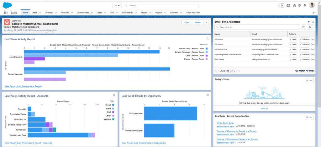
These days, if you want to make your business more efficient and profitable, you need to make data-driven decisions. However, that requires that you analyze your data to extract strategic insights, and you can’t go at it without the right tools. Luckily, Salesforce is known for its range of dashboards and today, we’re showing you the top 15 Salesforce dashboard examples.
It’s time to crunch the numbers and get the right insights!
1. Salesforce Dashboard Example #1: State of the Union Dashboard
When you want to see your business’s overall performance, the State of the Union dashboard is what you want to look at. It provides all the insights you need to gauge performance and, as such, shows you metrics like:
- Open pipelines
- Closed sales
- Sales activity by rep
- Month-over-month growth
- Forecast by month
And more! The major benefit of this dashboard is that you get these insights at a glance without needing to aggregate the data manually or compare different sources. It all feeds into your Salesforce HQ.
2. Sales Executive Dashboard
This dashboard provides data from sales representatives and territories. As such, it gives you an overview of all your sales activities at any given time.
This Salesforce dashboard example comes with several benefits. For one, it can help your senior managers with their day-to-day work. This means they can identify low-performing employees and create strategies to motivate them to perform better. Also, having this data available can help you in discussions with your senior management to allocate the budget for each sector based on their performance and potential.
Your Sales Executive Salesforce dashboard should contain data like:
- Prospects in the sales pipeline by stages
- Sales pipeline by sales rep
- Key competitors
- Key opportunities
- Activities by sales rep
- Forecast by month
In short: you should get everything you need to get a sense of your sales health at a glance.
3. Sales Activities KPI Dashboard
The Sales Activities KPI Dashboard is another useful data source for the sales managers who manage your sales teams. However, instead of providing insights into a specific team’s performance, it provides insights into how the sales team’s performance impacts the business’s profitability. These profitability-related metrics include:
- Margin by sales rep
- Deal size vs. discount
- Sales activity by rep
- Pushed opportunities
- Sales pipeline by sales rep
- Neglected accounts
And more!
4. Salesforce Dashboard Example for the Marketing Team: Marketing Executive Dashboard
Like the Sales Executive Dashboard helps your senior managers keep track of sales activities, this dashboard does the same regarding your marketing activities. As such, it shows you how your marketing campaigns perform and, more importantly, what difference they make in your lead generation and conversion efforts.
In other words, by looking at this dashboard, you’ll learn what’s working and what’s not. It’s also helpful for training your marketing team and keeping them accountable. If you decide to bring your sales and marketing teams together through smarketing, this Salesforce dashboard example will help you aggregate data across different accounts and keep everyone on the same page.
The metrics you should be looking at in your Marketing Executive dashboard include:
- Campaigns by ROI
- Lead trending report
- Lead conversion
- Converted leads
- Leads by industry
- Top marketing channels
- Lead source

5. Customer Service Supervisor Dashboard
The Customer Service Supervisor Salesforce Dashboard example is the ideal solution for senior managers who manage your business’s customer service teams. Some metrics it provides include:
- The age of open cases
- The number of open cases by priority
- The top-performing agents
- Case resolution time
This data can help your managers assess their team’s performance and how well they resolve customer issues with qualitative and quantitative data. If you want to ensure your key accounts are taken care of, you’ll see a handy column showing you how long they wait for a response from your team.
P.S. Using web-to-case in Salesforce? Include it in your dashboard!
6. Service KPIs Dashboard
The Service KPIs Dashboard is another helpful tool for the senior managers who manage your customer support teams. However, unlike the Customer Service Supervisor Dashboard mentioned above, this dashboard doesn’t provide insights into a specific team’s performance.
Instead, it overviews the entire business’s customer service processes. To do this, it provides data on metrics like:
- Cases closed by channel type
- Case distribution by type, priority, and support channel
- Cases closed trends
- Case resolution time
- Cases closed MTD and by priority
7. My Team Performance Dashboard
The My Team Performance Dashboard gives your sales managers deeper insights into your sales reps’ performance by providing data on metrics like:
- The top sales rep by revenue
- The number of demos scheduled
- The number of closed or won opportunities by revenue
- Year-over-year growth
- Neglected accounts
And more!
By keeping a close eye on this dashboard and its data, your sales managers can coach their teams more effectively. Apart from this, it’s also a valuable tool that you can use to motivate your sales reps and encourage them to hit higher targets by focusing on the activities they do best.
8. What Should a Sales Funnel Dashboard Look Like in Salesforce?
While there are universal criteria for sales funnel stages, every company’s funnel is unique. If you want to ensure prospects don’t leak out of it, you need tracking, which is where the sales funnel dashboard example comes in.
The sales funnel dashboard gives you insights into performance at every stage, all these stages and the value they contribute to your business’s revenue.
For example, you can review the pipeline shape with key revenue figures attached to each stage. However, you can also set up your Salesforce sales funnel dashboard to focus on activities, performance, and other metrics to see which funnel stage drives the most value.
9. Pipe Gen Dashboard
We’ve already mentioned how the State of the Union Dashboard gives you an overview of your business’s overall performance. In contrast, the Pipe Gen Dashboard allows you to drill down on metrics that give you insights into your business’s growth and progress.
Apart from this, the dashboard also helps you identify underperforming pipelines. You’ll be able to solve any issues before they become bigger problems, acting proactively rather than reactively.
Let metrics such as the following guide you on your route to success:
- Closed ACV
- Open pipeline metrics
- Pipe gen
- Outflow
- Weekly pipe gen in general, by source, by deal band, and by close date and stage
10. Open Pipe Gen Dashboard
Once you’ve identified a possible issue with any of your pipelines, the Open Pipe Gen Dashboard will help you figure out the exact problem. You’ll be able to drill down into the quality of your pipelines at various stages so you see where deals get stuck or why there’s no recent activity on a specific pipeline.
You should use the key metrics to uncover issues and monitor progress. For example:
- Open pipe by stage
- Open pipe next month
- ACV
- Pipe forecast
- Pipe by source and product
11. Activity Management Dashboard
How you spend your days is how you spend your life, or, in sales, the activities you perform dictate the revenue you’ll close. The Activity Management Dashboard gives you insights into your sales team’s activities, meetings, and pipeline.
As such, it shows you how many calls they make, how many emails they send, how many meetings they schedule, and how many interactions it takes to close a deal.
In other words, this dashboard shows you exactly how your sales reps spend their time. And once you’ve identified a pipeline issue in one of the Salesforce dashboard examples above, the Activity Management Dashboard is often the first place you should look to find solutions.
12. Pipeline Trend Dashboard
As the name implies, the Pipeline Trend shows you the value of the separate stages of a pipeline every month. From this information, you’ll then be able to see how much every stage contributes to your business’s revenue and if your pipeline is trending up or down.
When it trends down, you can then implement the necessary measures to improve your performance.
13. Age of Leads Dashboard
While this is more of a Salesforce report than a dashboard, many businesses use the Age of Leads report in dashboard mode due to the importance of the insights it provides. It shows you the age of leads in your pipeline as well as the activities on every lead. In short: it shows your lead quality and how active your sales team was in taking action on every lead.
Typically, when leads take longer to convert, and there are fewer activities on every lead, despite proper efforts by your sales team, it indicates lower quality leads. If this is the case, you can then optimize your prospecting and lead qualification processes to improve.
14. Forecast Dashboard
The dashboards we mentioned above all focus on past performance. In other words, they show you how well your sales team has performed, how much revenue you’ve generated, and how effective your marketing team was at generating leads.
Conversely, as the name implies, the Forecast Dashboard gives you insights into what might happen in the future. You can break data down by owner (sales rep), quota vs closed, open pipelines, and more.
For instance, when you know your predicted sales revenue, you’ll be able to plan your sales cycle better. In turn, you’ll also have a tool to manage expectations across your business.
15. Clean Your Room Dashboard
If you don’t have clean data, you’ll likely get inaccurate insights from it, and many of the other dashboards we’ve already mentioned will become less reliable. The Clean Your Room Dashboard prevents this and helps you clean your data to get the most accurate insights:
- Stuck opportunities and deals
- Accounts without any recent activity
- Opportunities without next steps
- Opportunities without competitors
It does this by encouraging your sales reps to use your CRM to maintain data accuracy. It also allows you to spot any instances where your reps are slow to follow up on a lead or where a deal has remained open for too long. In turn, this keeps your sales reps accountable.
Get Profound Insights into Your Business with the Top Salesforce Dashboard Examples
With Salesforce, getting the right insights into your business processes is as simple as choosing the appropriate dashboard. We hope this post showed you some of the best dashboards you can use to get started. And remember: even if none of these dashboards fit your needs perfectly, Salesforce is highly customizable. With a few Salesforce integrations, your team will be raring to close even more deals!


